
It Looked Perfect. So Why Did Everyone Leave?
We see it more often than you'd believe:
✅ Clean UI
✅ Stunning design system
✅ Impressive transitions
✅ Launched with fanfare
...and then nothing.
No real adoption. No conversions. Users bounce. And the team is confused.
“But the UI is great. People said they loved it!”
Here’s what we tell clients at Forest:
“Your product didn’t fail because it was ugly. It failed because it was misaligned.”
UI ≠ UX ≠ Product Strategy
Let’s break this down with hard truth:
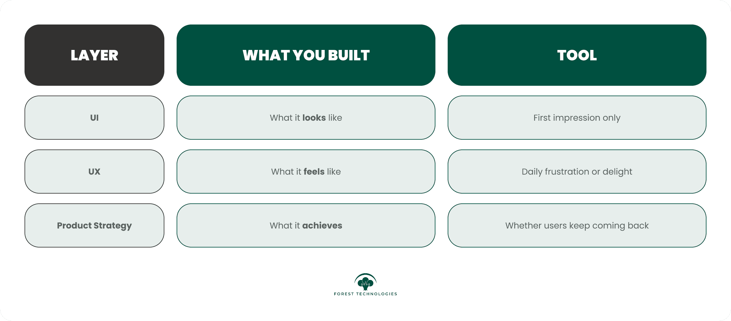
We’ve seen gorgeous products that failed — and “ugly” ones that scaled.
Why? Because the former looked like a product.
The latter functioned like one.
The Most Common Pattern We See at Forest
When clients come to us for help, here’s what we usually find:
🔄 Teams optimized for internal logic, not user value
🧩 Interfaces that mirror company structure, not user flows
💬 Onboarding that’s loaded with features, not clarity
📊 Metrics focused on launch, not long-term usage
They didn’t build a product.
They built a powerpoint deck in pixels.
And the market doesn't reward polish.
It rewards clarity, value, and momentum.
Real Client Example (With Numbers)
One of our recent clients — a fast-growing SaaS company — hired an award-winning design agency.
The result?
A dashboard that looked like a Behance dream.
But after launch:
Activation rate: 12%
Session time: <3 mins
Drop-off after onboarding: 70%+
They weren’t just losing users
.They were burning cash every day it stayed live.
The Forest Fix: What We Actually Did
We didn’t just clean up layouts or swap fonts.
We did what most design teams skip:
1. Diagnose Like Strategists, Not Stylists
Before opening Figma, we mapped:
Core user jobs-to-be-done
Points of friction in current flow
Activation curve breakdown
Support ticket themes
Feature usage heatmaps
Onboarding failure points
This is what most redesigns miss.
2. Rebuilt the Flow Around Strategic Intent
Each screen was restructured around:
🧭 User decisions, not company features
🔑 Value realization, not visual delight
🧱 Progressive disclosure, not overwhelm
We kept what worked, dropped what didn’t, and built around what mattered.
3. Redefined the Role of UI as Behavioral Guidance
We taught their team this principle:
“Every visual choice should push the user one step closer to success.
Color: used for cognitive focus
Copy: rewritten for clarity and urgency
CTA: no more vague “Start Now” — we used verbs with outcomes: “Create My First Plan,” “Get Instant Feedback,” “Start With a Template”
4. Tightened Feedback Loops and Validation
We implemented:
Real-time behavioral analytics
A/B testing for flow variants
Success metric alignment: time-to-value, repeat sessions, and support queries
The Big Lesson: Strategy Wins. Not Style.
Forest’s 5-Point UX Strategy Litmus Test:
Before you launch or redesign anything, ask:
What’s the #1 action we want users to take?
Is that action clearly guided — visually, verbally, and behaviorally?
What friction exists between landing and value realization?
Where are users confused — and how are we measuring it?
What signal are we using to prove this design is working?
If you can’t answer those in detail —
You don’t have a product. You have an interface.
Why Smart Product Teams Choose Forest
We’re not “just” designers. We’re builders, strategists, and teardown experts.
Forest is what happens when you combine:
🎯 Product strategy +
✍️ Strategic design +
🤖 AI-native systems +
💬 Real-world battle scars from working inside startups, enterprise, and scale-ups
We’ve helped:
AI tools go from demo to $MM ARR
MVPs achieve product-market clarity in weeks, not months
Corporate teams restructure 12-month roadmaps around what actually works
Founders finally understand why users drop — and how to fix it fast
TL;DR: Design is Not the Finish Line. It’s the Delivery System.
You don’t need “prettier.”
You need precision.
Design without strategy is decoration.
Design with strategy is differentiation.
Want Us to Take a Look?
If you’re unsure why your product isn’t converting — or you want a second brain to diagnose where users get stuck — let’s talk.
We’ll show you how we’d tear it down, rethink the flow, and rebuild it with outcomes in mind.
Book your Free Consultation
We’ve helped teams save hundreds of hours, unlock real usage, and stop designing in the dark.
Let’s do the same for you.
🌐 Visit theforest.ai
What’s the Most “Well-Designed” Product You’ve Used That… Flopped?
We’re gathering examples for a follow-up teardown post.
Drop yours in the comments — or tag someone building something that looks great but feels off.


